
Making portfolio information easier to understand
Investment platforms hold a great deal of information, but that does not mean the information is easy for a client to use. The underlying systems are usually shaped around advisers, reporting, and operations. A client opening a mobile app has a much more direct set of questions. How is my portfolio doing? Where is my money invested? What do I own, and what has changed?
All One Wealth wanted a mobile experience that could answer those questions without exposing the full complexity of the adviser platform behind it. The app needed to show a household-level view, then let someone move naturally into individual accounts, asset allocation, holdings, projected income, and recent activity.
Priority Soft designed and built the mobile layer. We mapped the relationships in the portfolio data, decided what belonged at each level, and kept the interface consistent from a broad summary into detail.
Turning financial hierarchy into a natural progression
We started by working through the structure of the information. A household can contain several accounts. Each account can contain different asset classes and holdings. Performance depends on the period being viewed, while transactions belong to specific accounts and investments.
These relationships are familiar to advisers but dense on a phone. Priority Soft translated them into navigation that reveals detail one level at a time.
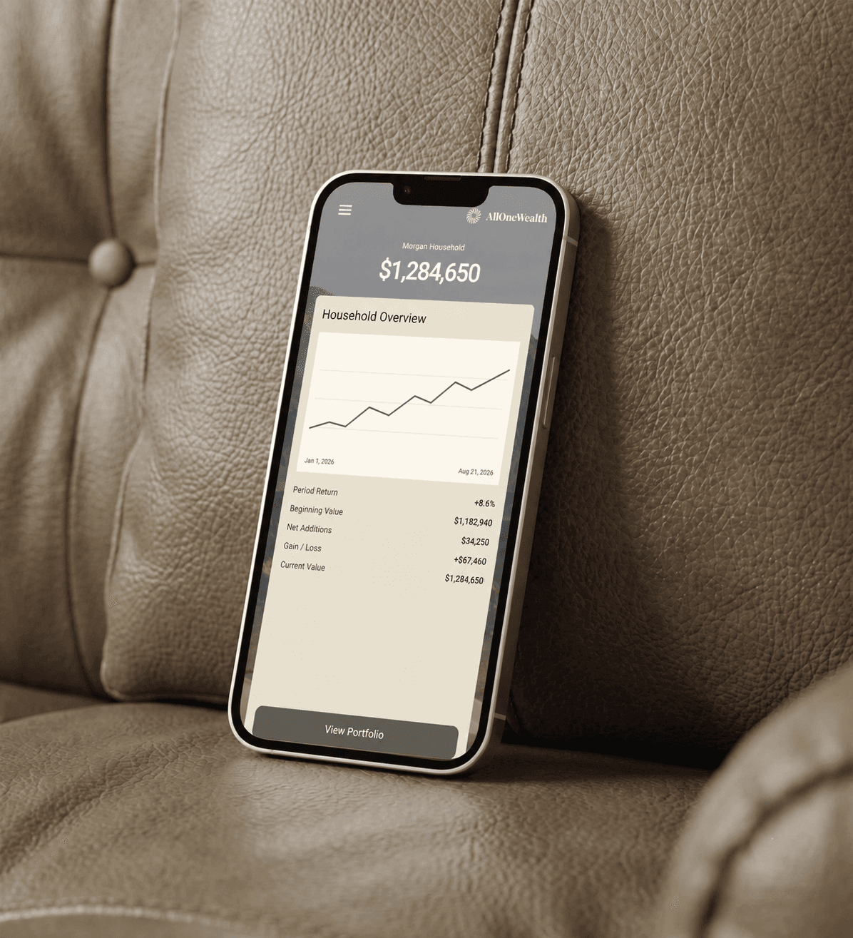
The home view gives the client an immediate sense of the household portfolio. From there, the user can explore how assets are allocated, open an account, inspect a holding, review performance over a selected period, or look through recent transactions. Each view answers one question before offering the next level of detail.
That sequence keeps the product useful for someone who wants a quick check while still supporting deeper exploration. A client does not need to understand the language or structure of the upstream portfolio system to find the information that matters.
Designing the portfolio overview
The portfolio overview had to balance breadth with restraint. Putting every available number on the first screen would have made the app look comprehensive, but it would also have made it harder to read.
We focused the opening experience on the information that gives context: total portfolio position, selected performance period, allocation, and clear entry points into accounts and holdings. Supporting views add the detail when the user asks for it.
Financial performance changes meaning with the date range. The interface keeps the selected period visible so users know what each number compares.
Clients can view allocation by account or asset class, then open the underlying investments. The same visual structure connects those views.
Treating integration as product work
The application receives portfolio information from Black Diamond. That integration shaped the product because the source system defines which values are available, how accounts are grouped, and how performance data is represented.
Priority Soft treated those constraints as part of the design process. Before committing to screens and interactions, we checked the data relationships and worked through what the integration could reliably provide. This avoided a common problem in financial software: a polished interface built around assumptions the real data cannot support.
The app receives portfolio information through a dedicated integration boundary. If the third-party portfolio service changes, the team can adapt the data there without rebuilding the mobile interface.
That separation also made the product easier to test. Loading states, errors, account selection, and date-range changes can be handled in the application logic while the screens remain focused on presentation and interaction.
A mobile foundation built for clarity
The application is built with Flutter and Dart, giving All One Wealth one shared product foundation for iOS and Android. Flutter was a practical choice for a design that relies on consistent charts, cards, navigation, and responsive financial views across both platforms.
The app uses BLoC-based state management to keep data loading and user selections outside the UI components. Portfolio summaries, accounts, holdings, transactions, and period changes each have a defined place in the application state. That keeps the code easier to reason about as the product grows.
Firebase services support authentication and product analytics across the application's history. Analytics gives the product team a way to understand which parts of the experience clients use, without changing the portfolio integration itself.
The overall architecture is deliberately straightforward: a Flutter interface, a controlled state layer, and a dedicated boundary around the financial-data provider. It gives the client a maintainable product without exposing the complexity of the upstream system to every screen.
Building trust through understandable design
Financial products have to earn trust in small ways. A label needs to be precise. A selected time period needs to remain visible. The relationship between a household, an account, and a holding must stay consistent from one screen to the next.
Priority Soft paid attention to those details because clarity is part of the product's function. The app is not trying to replace the adviser relationship or turn portfolio data into investment advice. Its role is to help clients understand the information already available to them and move through it with confidence.
Where Priority Soft made the difference
Our contribution combined product thinking with implementation. We worked through the financial concepts, challenged assumptions about the data, designed the information hierarchy, and carried those decisions into the Flutter application.
That continuity matters. When design and engineering are separated too early, the interface can promise information the integration cannot deliver, or the technical model can dictate a product that makes sense only to specialists. Priority Soft kept both sides connected throughout the build.
The mobile experience follows the client's questions instead of the source system's structure. The integration and data model handle the underlying organization.
The outcome
All One Wealth has a dedicated mobile experience for portfolio information. Clients can begin with the household view and move into accounts, allocation, holdings, performance, projected income, and transactions without learning how the adviser platform organizes its data.
The product gives the business a clean client-facing layer and a technical boundary around the external portfolio service. The team can refine the mobile experience without spreading provider-specific logic through every screen.